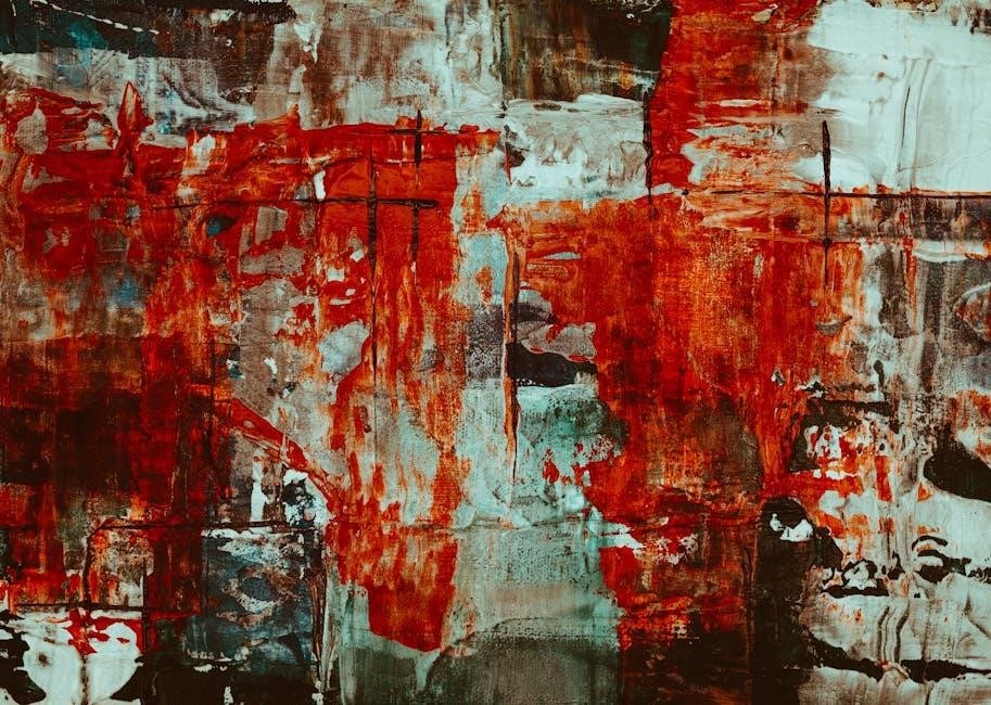
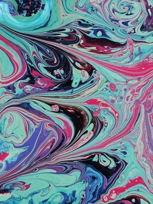
Acrylic color mixing unlocks creativity, allowing artists to craft vibrant, harmonious hues. Understanding color theory and the color wheel empowers painters to mix pigments effectively, creating rich, dynamic artworks with precision and confidence.
Understanding the Basics of Color Theory
Color theory is the foundation of effective color mixing, providing insights into how colors interact and influence one another. It involves understanding hue (the actual color), chroma (saturation or intensity), and value (lightness or darkness). These principles guide artists in creating harmonious color schemes and manipulating colors to achieve desired effects. By grasping these fundamentals, painters can predict how colors will mix and apply them confidently in their acrylic works, ensuring vibrant and balanced compositions.
Importance of Color Mixing in Acrylic Painting
Color mixing is essential for acrylic artists, enabling the creation of diverse hues and shades that bring paintings to life. It allows for capturing subtle shifts in light, mood, and atmosphere, while also enhancing compositional harmony. Mastery of color mixing expands creative possibilities, enabling artists to achieve realistic skin tones, muted neutrals, and vibrant contrasts. This skill is vital for expressing artistic vision and ensuring cohesive, impactful works, making it a cornerstone of acrylic painting techniques and artistic expression.
The Color Wheel and Primary Colors
The color wheel organizes hues, with primary colors—red, yellow, and blue—forming the foundation. These essentials mix to create secondary colors, guiding artists in understanding color relationships and harmonies.
Primary Colors: Red, Yellow, and Blue
Red, yellow, and blue are the foundational primary colors, forming the basis of all color mixing. These vibrant hues cannot be created by mixing other colors and are essential for crafting secondary colors like orange, green, and purple. In acrylic painting, primary colors such as Quinacridone Red, Benzimidazolone Yellow, and Phthalo Blue (Green Shade) are often used for their high chroma and tinting strength. They provide the starting point for creating a wide range of colors, from bold to subtle, and are crucial for achieving dynamic color harmony in artworks.
Secondary Colors: Orange, Green, and Purple
Secondary colors—orange, green, and purple—are created by mixing two primary colors. Orange emerges from red and yellow, green from blue and yellow, and purple from blue and red. The specific hues of these secondaries depend on the primary colors used, allowing for vibrant or muted tones. These colors add depth and variety to artworks, enabling artists to explore rich harmonies and contrasts in their acrylic paintings while maintaining balance and visual interest.
Warm and Cool Colors
Warm colors, such as red, orange, and yellow, evoke warmth and energy, often associated with sunlight and heat. Cool colors, like blue, green, and purple, create calmness and serenity, reminiscent of water and shade. These color temperatures influence the mood of a painting, with warm hues advancing and cool tones receding. Understanding their contrast and harmony is key to creating dynamic, balanced compositions in acrylic art, allowing artists to guide the viewer’s eye and evoke specific emotions effectively.

Understanding Hue, Chroma, and Value
Hue refers to the actual color, like red or blue. Chroma is the color’s intensity or saturation, while value describes its lightness or darkness. These elements are fundamental to acrylic color mixing, enabling artists to create rich, nuanced, and balanced compositions by adjusting these properties effectively in their work.
Hue: The Actual Color
Hue is the fundamental aspect of color, representing the actual color name, such as red, blue, or green. It is the base element that defines the color family and is not mixed with black or white. Understanding hue is crucial in color mixing, as it forms the foundation of all color combinations. By mastering hues, artists can create harmonious palettes and achieve desired visual effects in their acrylic paintings. This knowledge is essential for both beginners and experienced artists alike.
Chroma: The Saturation or Intensity of Color
Chroma refers to the saturation or intensity of a color, describing how bright or muted it appears. A lemon has higher chroma than a banana within the same yellow hue. In acrylic painting, chroma is crucial for creating vibrant or subtle effects. Organic pigments typically offer higher chroma, while inorganic ones tend to be more subdued. Understanding chroma helps artists control the brilliance of their colors, enabling them to craft dynamic, visually engaging artworks with precision and intent.
Value: The Lightness or Darkness of Color
Value refers to the lightness or darkness of a color, determining its position between white and black. It’s crucial for creating contrast and depth in acrylic paintings; To assess value, compare colors to a neutral gray scale or squint to isolate light and dark areas. Accurate value placement ensures visual harmony, even if hues vary. Mastering value enhances your ability to convey form, texture, and mood effectively in your artwork.
Acrylic Paint Characteristics
Acrylic paints are versatile, fast-drying, and durable, offering rich pigmentation. They come in heavy body for texture or fluid for detail, suitable for various artistic techniques and effects.
Types of Acrylic Paints: Heavy Body vs. Fluid Acrylics
Heavy body acrylics are thick and buttery, ideal for textured brushstrokes and impasto techniques. Fluid acrylics are thinner, offering versatility for detail work and smooth blending. Both can be mixed with mediums to enhance properties like transparency or drying time, allowing artists to customize their workflow. Heavy body paints retain their texture, while fluid acrylics flow easily, making them perfect for layering and glazing. Understanding these differences helps artists choose the right consistency for their creative goals.
Student Grade vs. Professional Grade Acrylics
Student-grade acrylics are more affordable, with lower pigment loads and less lightfastness, making them suitable for practice and casual projects. Professional-grade acrylics offer higher pigment concentration, better durability, and superior lightfastness, ensuring vibrant, long-lasting results. While student grades are great for beginners, professionals often prefer the richness and reliability of high-end paints. Both can be mixed, but understanding their differences helps artists choose the right quality for their creative needs and budget.
Mixing Different Brands and Types of Acrylics
Mixing different brands and types of acrylics is possible, but it’s important to consider their unique properties. Heavy body and fluid acrylics can be combined, but their viscosities may affect blending. Student-grade and professional-grade paints can also be mixed, though professional grades typically have higher pigment loads and lightfastness. Always test compatibility, as some brands or types may vary in consistency or drying time. Using a wet palette and retarders can help maintain consistency and extend blending time when mixing diverse acrylics.
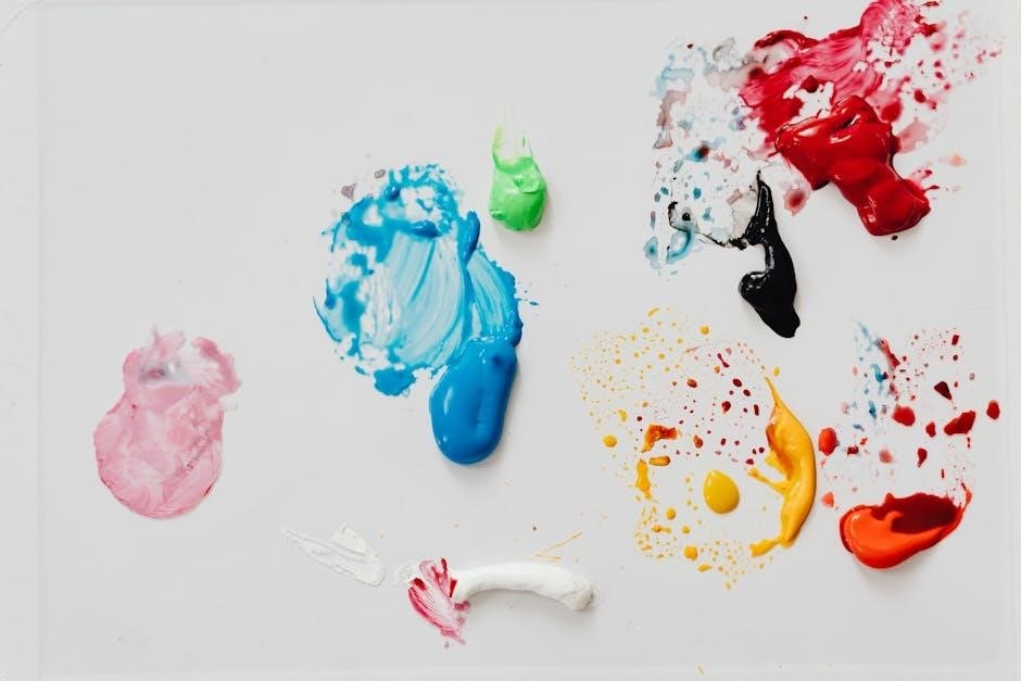
Pigments and Their Properties
Pigments, the essence of acrylic paints, vary in type and properties, influencing color mixing. Organic and inorganic pigments offer different chroma, transparency, and lightfastness, affecting artistic outcomes.
Organic vs. Inorganic Pigments
Organic pigments, like Quinacridone Magenta, are synthetically derived, offering high chroma, transparency, and tinting strength. Inorganic pigments, such as Titanium White, come from minerals, providing opacity and durability but lower chroma.
Undertones and Their Role in Color Mixing
Undertones are the subtle hues visible when paint is applied thinly or mixed with mediums. They significantly influence color mixing, especially in transparent layers or glazes. For example, Quinacridone Magenta may reveal blue or red undertones when thinned, affecting the final mixture. Understanding undertones helps predict how colors will interact, ensuring desired effects in acrylic painting. This knowledge is crucial for creating rich, layered works with depth and luminosity, as undertones can enhance or alter the overall color harmony in a piece.
Tinting Strength: How Colors Influence Each Other
Tinting strength refers to a color’s ability to influence others when mixed. Strong tinting colors, like Phthalo Blue, dominate mixtures, while weaker ones, such as Yellow Ochre, subtly blend. To test, add equal parts of a color to Titanium White; strong tinting colors will retain their vibrancy, while weak ones will lighten significantly. This property is crucial for predicting how colors will interact in a mixture, ensuring desired hues and avoiding unintended results in acrylic painting.
Creating a Limited Color Palette
A limited color palette enhances harmony and reduces complexity. Start with titanium white, a warm and cool primary set, and earth tones to mix a wide spectrum of colors effectively.
Choosing a Basic Palette for Versatility
Start with titanium white, warm and cool primaries (e.g., Quinacridone Red, Benzimidazolone Yellow, Phthalo Blue), and earth tones like Yellow Ochre. These essentials allow you to mix a wide range of colors, from bright hues to muted tones, ensuring versatility and harmony in your work. This foundational palette minimizes complexity while maximizing creative potential, enabling you to achieve both subtle and vibrant effects with ease.
Mixing a Wide Range of Colors from a Limited Palette
By combining primary colors, earth tones, and whites, you can create a vast spectrum of hues. Tinting with white lightens colors, while toning with grays softens them. Glazing adds depth and luminosity. Experimenting with layering and undertones allows for rich, nuanced shades. This approach minimizes palette complexity while maximizing creativity, enabling artists to achieve both bold and subtle effects with ease. It’s a practical way to explore color theory without overwhelming your workspace.

Mixing Skin Tones and Muted Colors
Mixing skin tones involves blending primaries with earth pigments and grays. Use layering and glazing for depth and luminosity, creating realistic, subtle hues for portraits and natural scenes.
Techniques for Mixing Realistic Skin Tones
Mixing realistic skin tones involves blending primaries with earth pigments and grays. Start with a base of Titanium White, Yellow Ochre, and Burnt Sienna for warmth. Add touches of Red or Blue for undertones. Layering and glazing techniques enhance depth and luminosity. Use thin, transparent layers to achieve soft transitions. Experiment with subtle shifts in hue and value to capture natural flesh tones. Document your mixes for consistency, ensuring each tone aligns with the subject’s lighting and anatomy for lifelike results.
Creating Muted and Neutral Colors
Muted and neutral colors are achieved by mixing complementary hues or adding gray. Start with a base color, then blend its complement in small amounts. For example, mix blue with orange to mute it. Earth pigments like Yellow Ochre and Burnt Sienna also create soft, neutral tones. Adding Titanium White or Zinc White reduces chroma, while Carbon Black deepens value. Experiment with layering thin washes for subtle shifts in tone, ensuring harmonious, balanced results in your artwork.
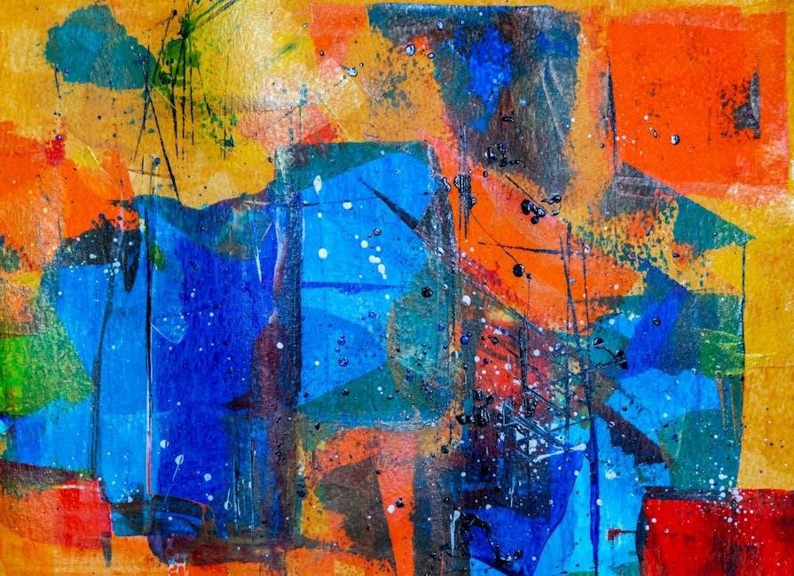
Advanced Color Mixing Techniques
Advanced color mixing involves layering and glazing for depth and luminosity. Using mediums enhances blending and creates intricate, professional finishes in acrylic artworks.
Layering and Glazing for Depth and Luminosity
Layering and glazing are essential techniques for achieving depth and luminosity in acrylic painting. By applying multiple thin, transparent layers, artists can create rich, intricate colors and subtle shifts in tone. Glazing involves using transparent pigments over a base coat, enhancing color intensity and light reflection. These methods allow for nuanced blending and texture, adding dimension to the artwork. Using retarders or slow-drying mediums extends working time, ensuring smooth transitions and vibrant, professional finishes.
Using Mediums to Enhance Color Mixing
Mediums play a crucial role in enhancing acrylic color mixing by altering paint consistency and drying time. Retarders and slow-drying mediums extend blending time, preventing colors from drying too quickly and allowing for smoother transitions. Glazing mediums create transparent layers, intensifying hues and adding luminosity. Textured mediums can introduce unique effects, while matte or gloss finishes control sheen. By incorporating mediums, artists gain greater control over color intensity, texture, and overall composition, enabling intricate and dynamic visual outcomes in their work.
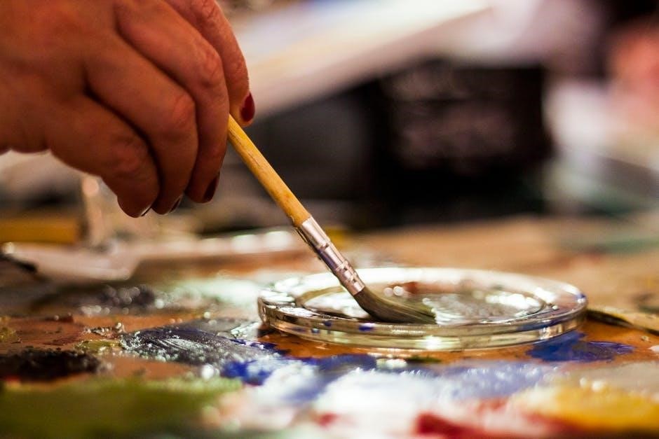
Practical Tools for Color Mixing
A wet palette preserves paint moisture, while retarders and slow-drying mediums extend blending time. Palette knives aid in mixing, and spray bottles keep colors fresh for smooth transitions.
Using a Wet Palette for Better Blending
A wet palette is a valuable tool for acrylic artists, keeping paints moist and workable for extended periods. By maintaining humidity, it prevents colors from drying out too quickly, allowing for smoother transitions and blending. This is especially useful for layering and glazing techniques, where consistent paint viscosity is crucial. Many artists pair it with a spray bottle to refresh the palette as needed, ensuring optimal conditions for intricate color mixing and achieving professional-grade results.
Retarders and Slow-Drying Mediums
Retarders and slow-drying mediums extend the working time of acrylic paints, preventing them from drying too quickly. This allows for smoother blending and layering, reducing the risk of muddy colors. By slowing the drying process, these mediums give artists more time to achieve subtle transitions and intricate details. They are particularly useful for techniques like glazing and layering, where maintaining wet paint on the canvas is essential for desired effects. This enhances control over color mixing and overall artistic expression.
Documenting Your Color Mixing Process
Documenting your color mixing process helps track experiments and ensures consistency. Create a personal guide, noting proportions of each color used to achieve specific shades and effects.
Creating a Personal Color Mixing Guide
A personal color mixing guide is essential for tracking your experiments and achieving consistent results. Start by noting the proportions of each color used to create specific shades. Include details like brand, type, and ratios for accuracy. Documenting your process helps refine techniques and saves time. Use a notebook or digital tool to record recipes, ensuring future reference. This guide becomes a valuable resource, allowing you to replicate hues and explore new combinations with confidence.
Recording Recipes for Consistent Results
Recording color recipes ensures consistency in your acrylic painting process. Note the exact proportions of each color used, including brands and viscosities. Document the steps taken to achieve specific hues, such as layering or glazing techniques. Include details like drying times and medium additions. This documentation saves time and reduces trial and error. Store your recipes in a dedicated notebook or digital app for easy reference. Over time, this collection becomes a valuable resource for replicating favorite colors and exploring new combinations with precision.
Exercises and Projects to Practice Color Mixing
Start with simple color wheel exercises to grasp primary and secondary hues. Progress to mixing skin tones and muted colors for realism. Advanced projects involve creating vibrant, layered landscapes, ensuring mastery of color theory and technique.
Simple Exercises to Master Color Basics
Begin by creating a color wheel using primary colors—red, yellow, and blue. Mix these to produce secondary colors like orange, green, and purple. Practice making a value scale by gradating black and white. Experiment with tinting by adding white to vibrant hues. Use a wet palette to keep paints fresh for smooth blending. These foundational exercises build confidence and familiarity with acrylics, helping you understand how colors interact and blend. Start simple to master the basics effectively.
Advanced Projects to Apply Color Mixing Skills
Challenge yourself with complex compositions, such as capturing skin tones or creating atmospheric landscapes. Practice layering and glazing to achieve depth and luminosity. Experiment with warm and cool color contrasts to evoke emotions. Try replicating a vibrant painting, like Karen Offutt’s, focusing on precise value and temperature. These projects refine your ability to mix and blend, pushing your artistic expression to new levels while mastering advanced color techniques.